Designers often look at color forecasts, and make up palettes and color stories, built around concepts for the season. The 2013 Pantone Color of the Year, Emerald, is described as “…the color of growth, renewal, and prosperity—no other color conveys
regeneration more than green.” Well, that’s an optimistic choice for the new year.
Pittsburgh Paints has a color sense game online to help you find your color palette matched to your personality choices: http://www.voiceofcolor.com/digital-color/color-sense-game
Sherwin Williams has videos for color stories with names like Midnight Mystery (“The colors are moody, the vibe is masculine and the aesthetic is both Victorian and futuristic.”) Watch the video to see how they match the colors with the words and ideas.
If you want to surround yourself with a color you find inspiring, Sherwin Williams offers an app for you phone to color match whatever you photograph with a paint.
From The Ultrabright:
SS2013: Color forecast confirmation + Global color overview
analysis |Nov, 2012
In December of 2011 we predicted that for the spring/summer 2013 season the consumer would continue to drift between the real and unreal – their fantasies and reality. We also predicted that for the upcoming season the color focus will be on nature-inspired shades, 90s bleached hues and hyper-real brights. Here we offer you a confirmation of the colors we predicted for spring/summer 2013, Future Color Forecast: spring/summer 2013, as well as a global overview of the most important colors for the upcoming summer season, as seen during the four major fashion weeks: New York, London, Milan and Paris. …read more
Lenzing is a company that makes color. PDF with some lively color stores and palettes to give you insight for future trends:
http://www.fashiontrendsetter.com/downloads/Lenzing-Trends-Autumn-Winter-2013-14.pdf
Pantone has developed home and interior decoration color stories for 2013. Here’s what they estimate people are thinking about:
The nine palettes for 2013 are: Connoisseur, Glamour, New Old School, Rugged Individuals, Extracts, Footprints, Sojourn, Surface Treatments and Out of the Ordinary.
The palette called Connoisseur takes a fresh approach to celebrating the finer things in life while displaying a sense of history and elegance. Whether it is the perfect plate or the smooth finish of a simple table linen, these fine sensibilities are often reflected in a choice of colors that are both sophisticated and refined, yet not without a touch of understated drama. The colors are a compilation of monochromatic violets and orchids, liquid pink, deep mahogany, alyssum white and beechnut green, all reflected against champagne beige and silver.
Read more: Pantone View Home + Interiors 2013 Trend Forecast http://www.dexigner.com/news/24716#ixzz2G7UHQR7J
I’m not suggesting that I do or you should follow seasonal color trends, but I find it interesting to see how other artists pair content with color choices, and how this reflects the mood/s of the times. The color forecasting people do an interesting job with this. The ideas that color and value choices (and thereby focus) are about more than being “pretty” or appealing – that color and value carry emotion and meaning – help to shape the works that bring your values to the table. We need, in both real and metaphoric terms, more people bringing personal values to that table.
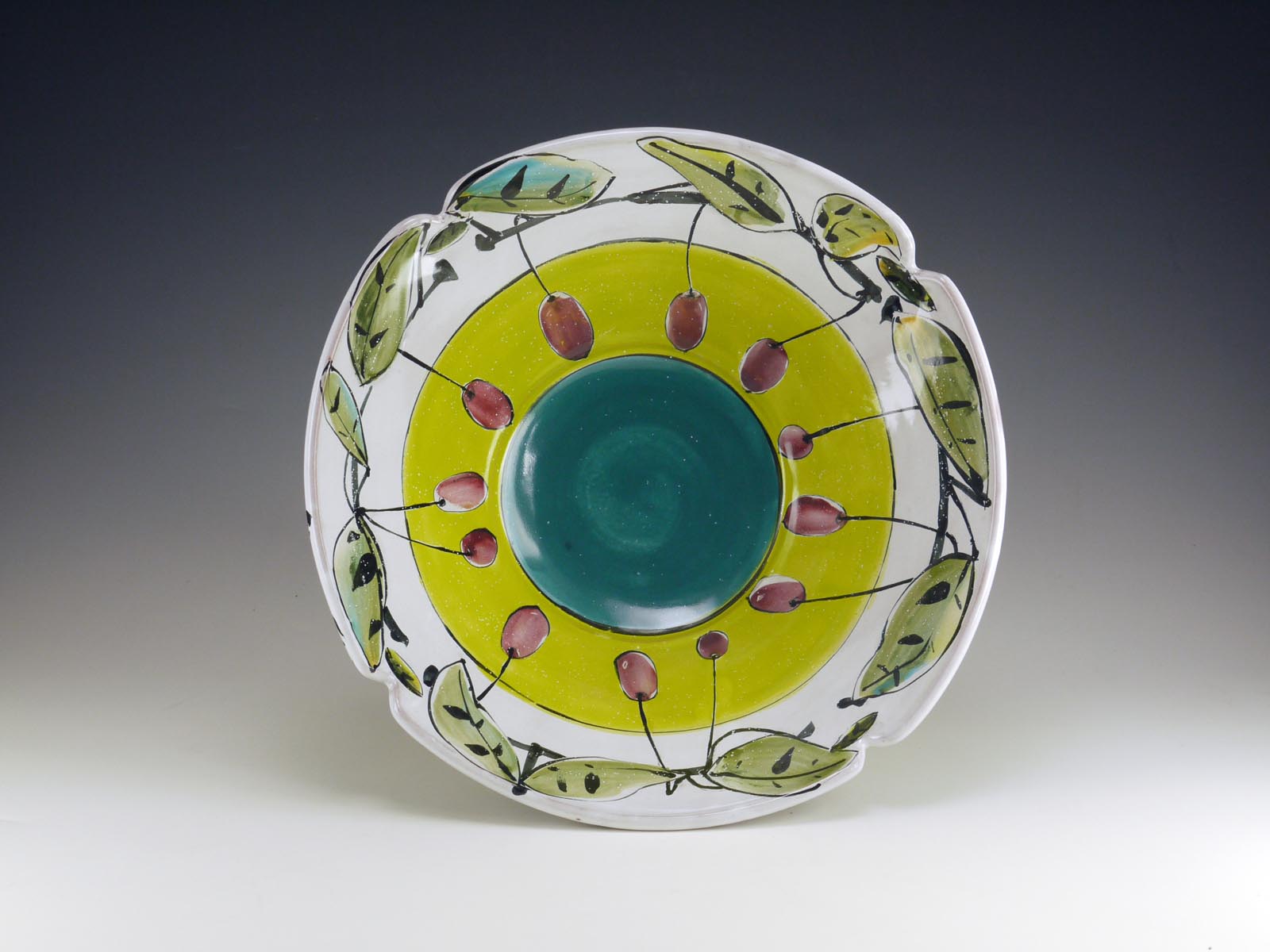
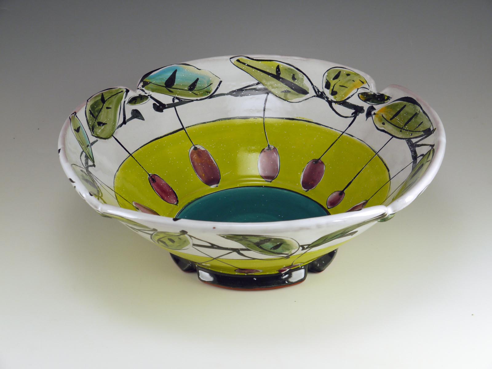
Below, a bowl that features a yellow-green next to a cool teal, accented with purple fruit. Chartreuse can be a color that denotes envy, to me. “Green with envy” doesn’t seem emerald-colored, but more sulphurous green. It’s easy to mix by volume for majolica decoration with a bright praseodymium yellow stain and copper – mixed 1/2 bentonite: 1 copper: 3-4 yellow stain: 3 frit 3124 or similar. Add a couple drops CMC gum or glycerin if you choose. Too much gum makes it slippery and hard to put down evenly. I do love that color, in general. It’s also the color of new leaves in many plants, and the color of sunlight through new leaves – I see it most often as a growing, optimistic color. In this bowl, I imagined the fruit as the fruits of one’s labors, and being a bit envious of the ripeness of that fruit. The purple-toward-red is a complement to the green-toward-yellow, making both colors richer. The teal is a darker value, and makes the bottom of the bowl recede. The white rim (and lighter value of the leaf colors) helps the form expand visually toward the top, with a re-statement of green and blue-green to link to the rest of the bowl.


Hi Linda,
I leave in Italy and I am an absolutely enthusiastic of potter. I saw your works. They are really great.
I saw a video about your technique but there is one piece of information which I miss. What is the wax resistant? Is a commercial one or a homemade. I will really appreciate any hints from you. I tried to look for something similar in Italy but I never succeeded.
Thanks!
Hello Alessia, I use a commercial wax resist that is water-thinned, Forbes Wax Resist from Highwater Clays in Ashville, NC. There are other brands, as well. It’s a thin, translucent wax that is acrylic, so it can be thinned with water but dries to be water resistant. I don’t know what products are available in Italy, but perhaps the people from La Meridiana would know, as they often have American artists in and must have supply lists from them. http://www.lameridiana.fi.it/
I love your enthusiasm for your work! You’re in good company. Linda
Hi Linda,
thanks a lot for the answer. I found it on US shops, now I need to understand how to get in Italy to a reasonable shipping price 🙁
Anyway I will not be discouraged.
I also saw that GDC colors are disappearing. I never tested them but looking at your work they seem great. It is really a pity since I was trying to buy them.
Thanks again and again and again my total admiration for your great work!