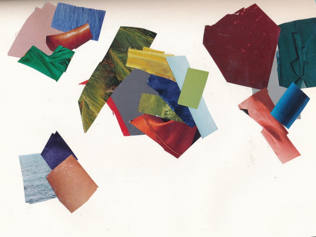
Color gives emotional tone and interest to our visual world. Color can be indulgent, luscious. Many companies that deal with color do or subscribe to color forecasting and use color stories to shape a concept around a palette. Color services make a business out of selling subscriptions to color forecasting.
Lenzing manufactures fibers, and deals with color. The have free trend forecasts. Their Fall 2013/Winter 2014 forecasts are here.

To quote from their Hands On theme for the season:
HANDS ON
To make with your hands; craft, handmade, artisan and all derivates … along with creativity going from designer-artisan to digital-craft; the user sensing the affection the maker put in making an object. Does mass customizing develop different identities by proposing 613 types of socks, wanting to match everybody … when is more too much?
To create smart engineered designs; incredibly inventive thinking out- of-the-box is unfolded to find ways out of the huge challenges of the present … and of the future.
To be responsible as producer and supplier is an unavoidable claim from the user.The consumer demands that pleasure links to responsibility, that grandeur and beauty is not the opposite to liability. Everybody takes on ones shoulders to make the sensible choice innumerable times in everyday-life … the consumer-driven community is pace setting.
This is how we conceive all this to be, on the fashion scene, through our themes: ELITIST, MAJESTIC, SYNTHETIC, EDIBLE and STORM.
Go to their web site to see more about how they interpret Elitist, Majestic, Synthetic, Edible, and Storm. I love the rhetoric that goes with the forecast. Some are waaaay over the top and not linked to the visuals, but most are a fun way of making choices and organizing them into a coherent group.
I subscribe to a few big, colorful magazines, like W from Women’s Wear Daily,

because they are cheap eye candy and give me a lot of material for what a certain zeitgetist has going on, and great resources for color development. It’s hard to make time to do this in a busy day, but it’s worth “playing” now and then to research. Look at colors that catch your eye, or think of your own color story word and go from there. In magazines, color is surrounded by other color and image and often reads differently in context than as a swatch. It’s an interesting exercise to remove color from image and adjacent color, and see how you perceive the hue. Move the colors around into groups, and think about what’s next to what, and relative amounts – it’s all important in how a color palette works. When you’re happy, glue them down on paper. THEN, cut a small window out of a blank white paper, and use this as a “finder” to vignette your compositions and further refine the proportions that look good to you.